Xamarin Forms FlexLayout
FlexLayout came in version 3.5 of Xamarin Forms and until now it's an Unknown Element when choosing from a layout type for our screens or views.
In general on Xamarin Forms you opt for a Grid Element or a StackLayout.
What is FlexLayout?
FlexLayout is as the name, a layout that efficiently provides us several ways to assign our views (controls) on the screen, making it easier for us to design, align our views and distribute the space between our views and the screen.
This layout is very interesting because it provides us with a better proportional size for the views, because it organizes the views in a proportion based on the dimentions of our screen and between the views of the screen.
To start using FlexLayout, simply add the following code on your xaml page:
FlexLayout Properties
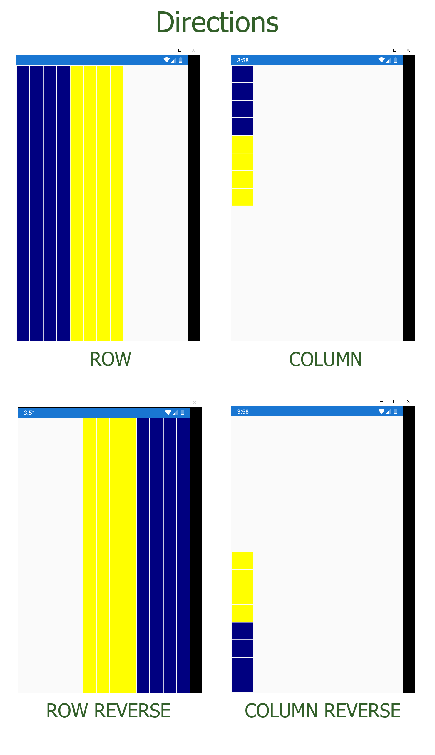
One of the most important properties is Direction which contains the next values:
- Row: When using this property we indicate that the elements inside the container will be placed in an orderly way from left to right, that is horizontally. In the "flexible" world the word horizontal is not used, but main-axis instead.
- Column: When using this property we indicate that the elements inside the container will be placed in a stack, from top to bottom. In the flexible world the word stack or vertical is not used, but cross-axis instead .
Note: Some of the properties of the FlexLayout mentioned below apply only to the main axis or the transverse axis.
- RowReverse: The same as row but with the difference that the elements will be placed from right to left.
- ColumnReverse: The same as column but with the difference that the elements will be placed from bottom to top.
By default, all the FlexLayouts Elements has by default Row.
Here are some ScreenShots:
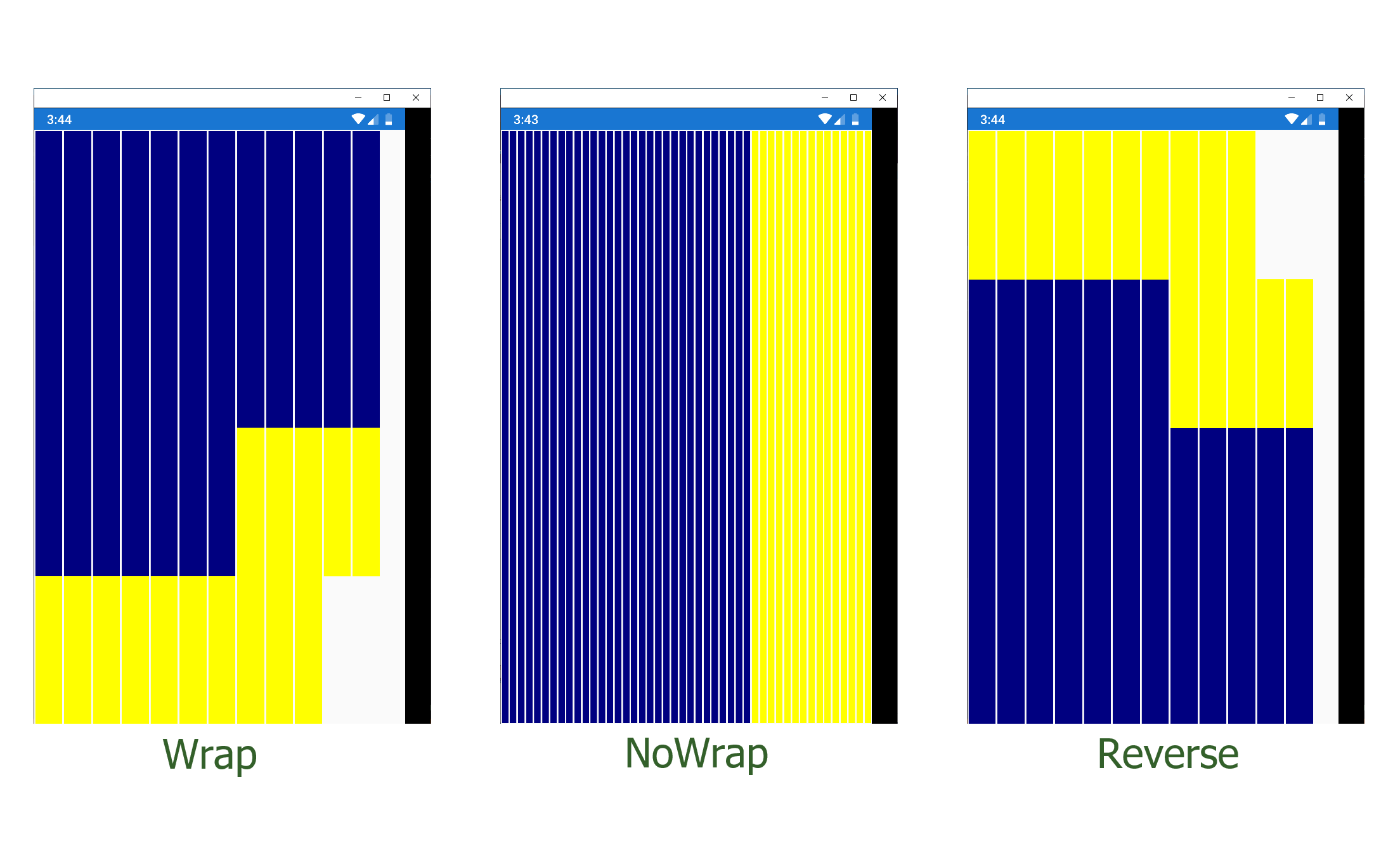
Other interesting property is Wrap. Using this property we can organize the location of the components, by default, they are all stacked in a single row in an orderly way one after another. If we want to change that behavior we can stablish it with the following values that we have:
- NoWrap: All Elements are placed on the same line.
- Wrap: All elements are placed on multiple lines from top to bottom.
- Reverse: All elements are placed on multiple lines from bottom to top.
- Default: All of our FlexLayouts defaults to NoWrap.
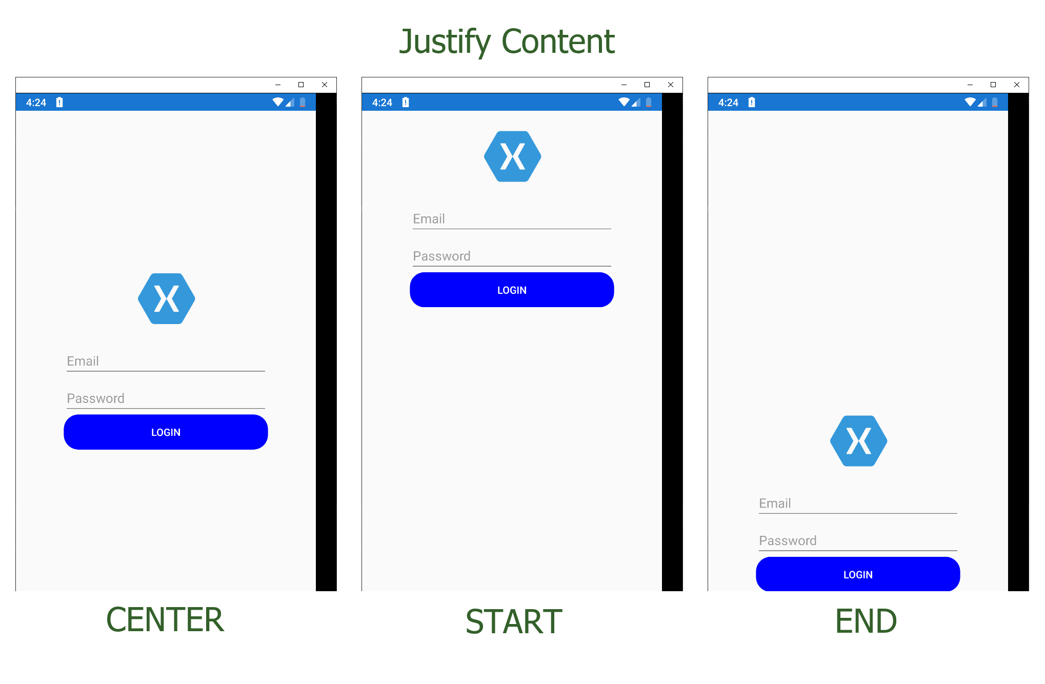
Justify Content
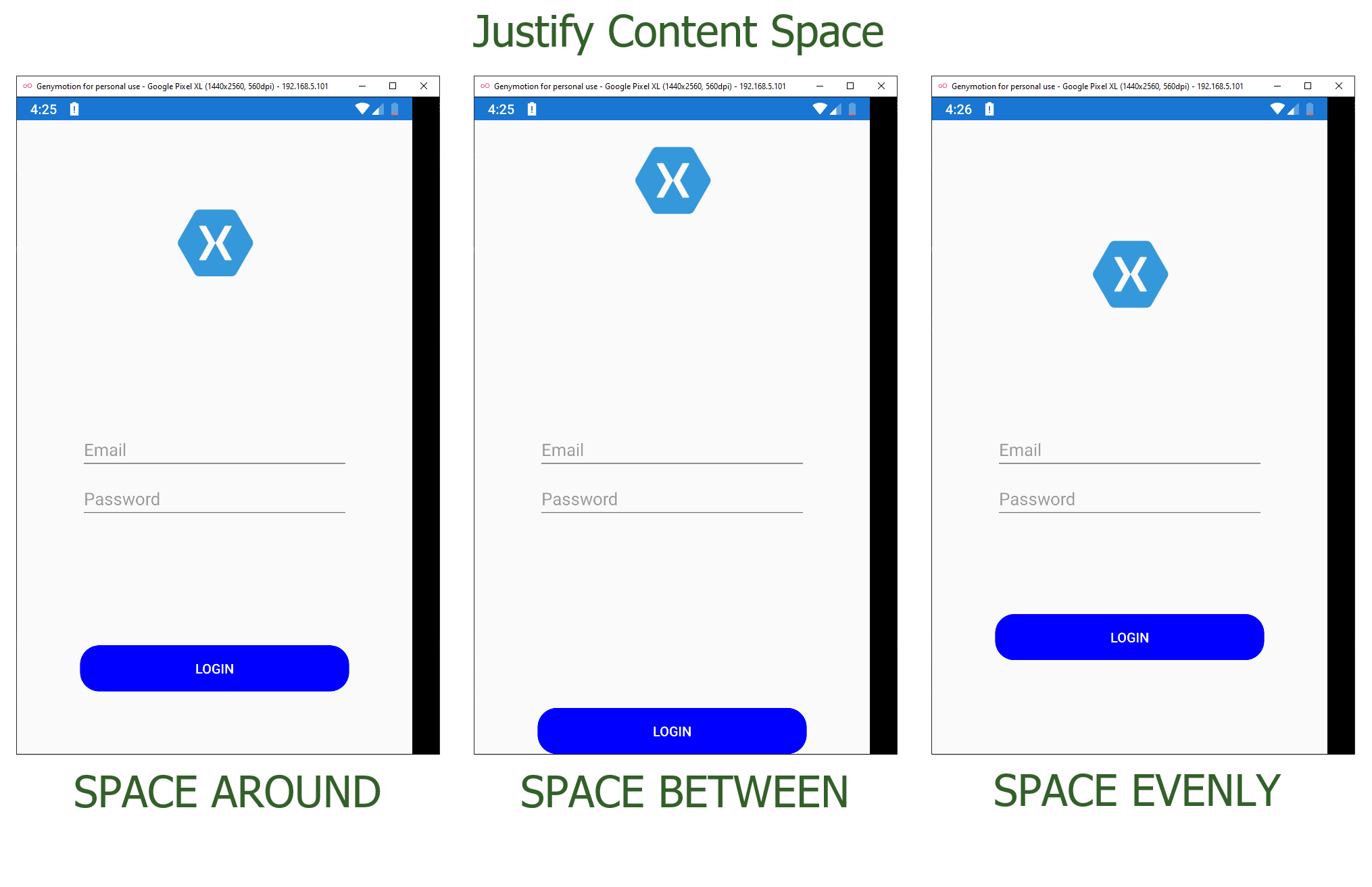
This property organizes the elements of main-axis. If we need to change that way we can stablish it with the next values:
- Start: All elements will be grouped at the beginning of main-axis.
- Center: All elements will be grouped at center of main-axis.
- End: All elements will be grouped at the end of main-axis.
- SpaceBetween: All elements has the same space between each element.
- SpaceAround: All elements retain the same space between each element, but it start with an unit of space for border and two respective units for other elements in the container.
- SpaceEvenly: All elements are distributed retaining the same space between elements and borders.
By default, all our FlexLayout has by default Start.
Align Items
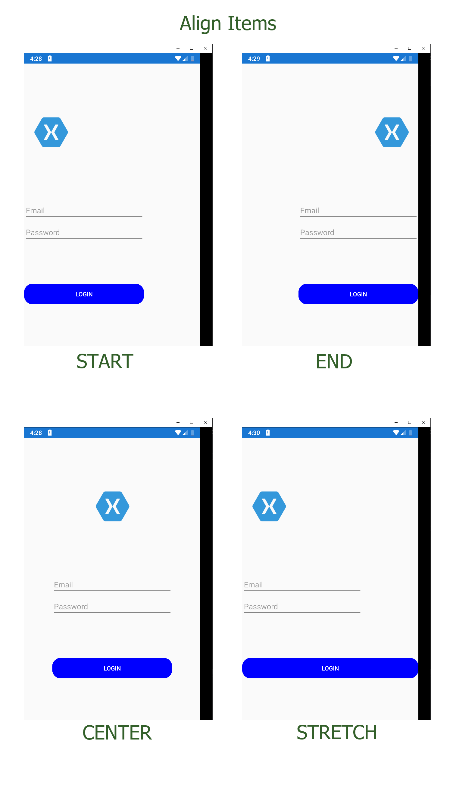
Similar to the previus one, the main difference is that this property defines the behavior of the transverse axis. The values we have are:
- StartCenterEndStretch: This property extends the entire element to fit the screen.
The rest of the options will group the elements at the beggining, at the center and at the end of the transversal axis. It is the same as described above but changing axis.
In the code uploaded on github you have a View called Login so you can test these properties (Align Items and Justify Content) to see and understand how it works.
Align Content
This property only works when we wrap our container. Thanks to AlignContent we can control the additional space on the transverse axis. The values we have are:
- Start
- Center
- End
- Stretch
- SpaceBetween
- SpaceAround
- SpaceEvenly
By default, all of our FlexLayouts values are stretch. The rest of the options are the same as the properties that we mentioned before on JustifyContent with the exception of stretch, which is not available in JustifyContent but that we saw above with AlignItems.
On the repo you will find a view called AlignContentView in which you can test this property.
Properties of each element
We can not only change the behavior of our layout with its main properties, we can also adapt the properties of each element that we have in our container.
To do this, we have FlexLayout.Grow and FlexLayout.Basis.
FlexLayout.Grow
This property accepts values from zero to any positive numeric value. By default the value is zero. With this value we tell our element not to stretch to fit the excess space.
If instead we want our element to occupy the entire screen we will set the value to 1 and the element will take up all the space.
If we have two or more elements, the values assigned to it always indicates which proportion will occupy our element relative to the others. Let's look at a small example.
Suppose we have 3 grid and I want the second element to be twice the size of the first element and the third element. My code would be as follows:
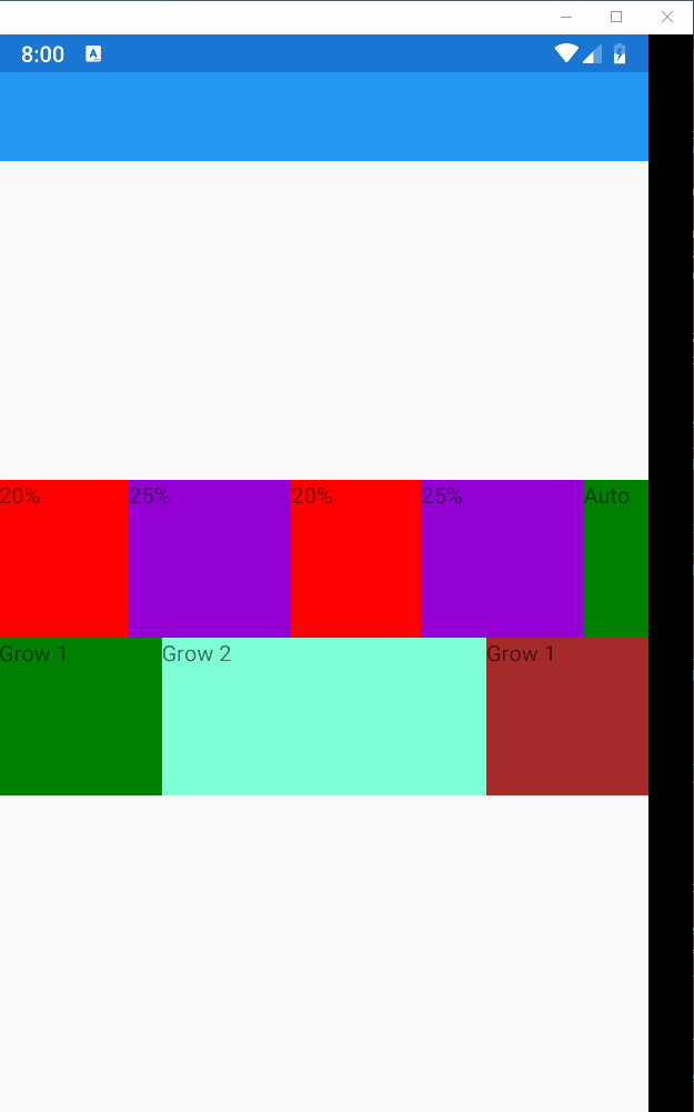
Both the first and third elements the value of the FlexLayout.Grow will be one and the second element will be two. With this we are telling you that the second element will be twice as much as the other elements.
If we only have one element, indicating the value one is more than enough since being the only element will stretch the entire screen.
FlexLayout.Basis
This property defines the size that an item will have before the excess space is distributed. Like
FlexLayout.Grow, the values assigned to it always indicate what
proportion our element will occupy. In this case it is assigned with a percentage, although it also accepts units of value. We have another option and it is to use reserved words like Auto. This property gives us more add-in control over the
FlexLayout.Grow property over the size of each child element in the container.

Conclusions
My impression with this layout is that we have properties similar to that of a Grid or a StackLayout but with much more power. The flexibility to place our visual elements that it gives us today we do not have it with any other layout.
What stands out most about this layout is the great help we have to accommodate and align our views within a screen, wrap them if there are many views/elements to fit in a single row or column and above all the options we have to adapt to any type of screen size and orientation of the device.
Finally here's the code on GitHub.
